
Great signage is more than decoration. It is a language of light, shape, and motion that helps customers notice, understand, and remember you. When you treat visuals like a strategic asset, you turn everyday moments into brand cues that guide people from the street to the sale.
Table of Contents
Why Visual Statements Matter
Visuals do heavy lifting in noisy spaces. They cut through clutter, set a mood, and tell people where to go. Most of all, they help your brand feel intentional and consistent.
Start by defining the single message you want a passerby to get in 3 seconds. If you try to say everything, people hear nothing. Keep the copy short, elevate the brand mark, and let one strong visual element do the work.
Think of visuals as fast language. Color, scale, and light speak before words do. A crisp layout with clear contrast helps people understand your offer at a glance and decide if they should step closer. Consistency builds trust. When your exterior sign, window graphics, and interior accents follow the same rules, customers feel anchored. Repeated cues reduce friction and make navigation feel natural.
The Psychology Of Light And Motion
Our eyes are drawn to contrast, rhythm, and glow. Light signals relevance, and gentle motion suggests life. Use these cues with restraint so attention turns into comprehension.
Motion should feel purposeful. A slow pulse on a highlight or a brief sparkle on a key word can guide the gaze. Constant flashing creates fatigue, so use transitions sparingly and anchor them to moments that matter.
Designing For The Journey
Think in stages: attract, orient, confirm. The exterior pulls people in, the entry directs them, and point-of-sale visuals reinforce the choice. Align each stage to a single goal so the experience feels seamless.
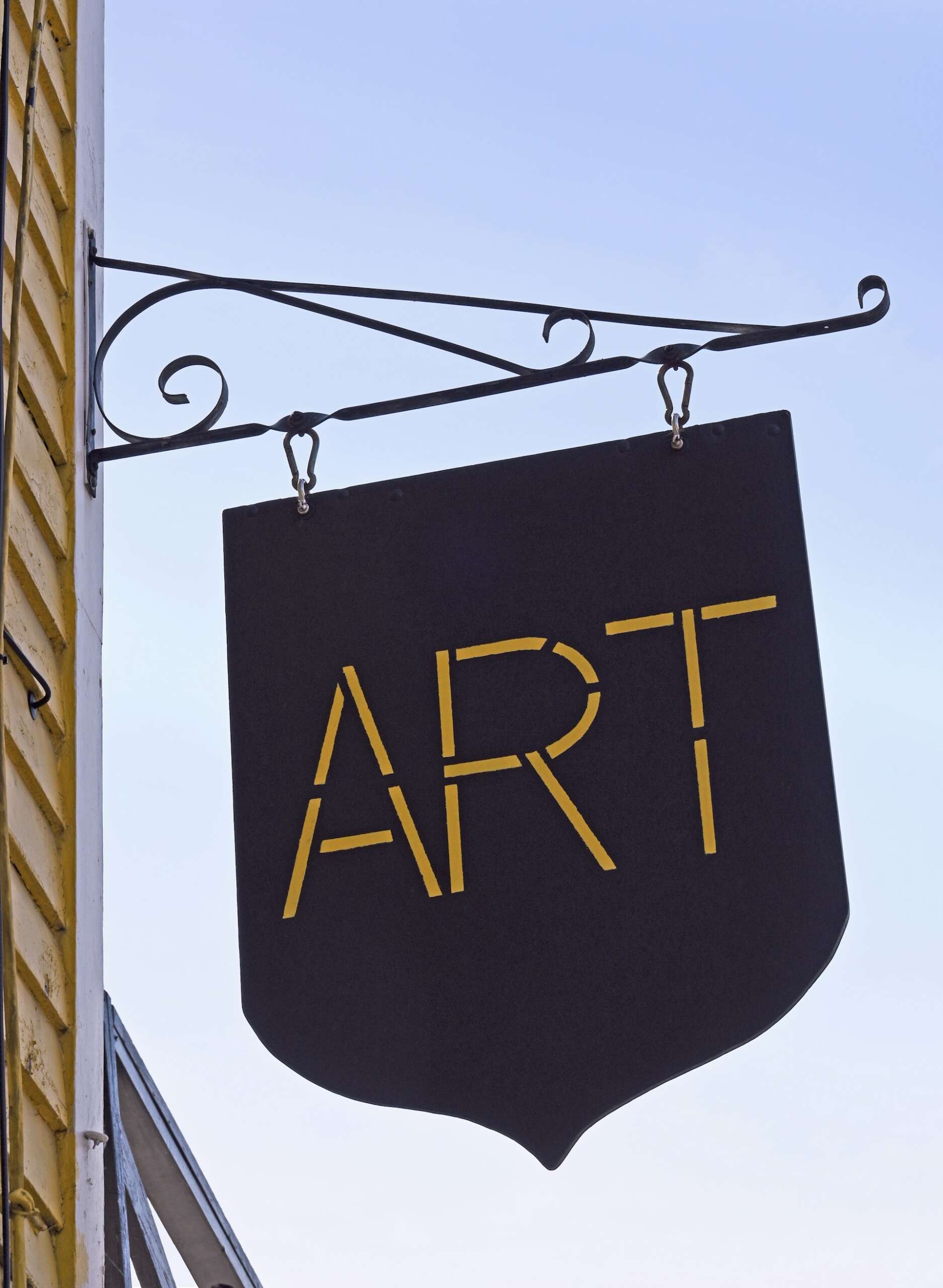
Set a hero element that visitors can spot from across the street. Consider custom LED neon signs when you want a distinct color and legible glow without overwhelming energy use. Place secondary cues at eye level near the door so newcomers know what to do next. Inside, use smaller accents to highlight menus, new arrivals, or seasonal stories.
Readability, Contrast, And Scale
Readability is your nonnegotiable. Choose high-contrast color pairs and avoid thin letterforms that get lost at a distance. Test your layout at 25%, 50%, and 100% size to validate legibility from the sidewalk and the street.
Set a strict hierarchy. The primary line should carry the offer or brand in the largest, boldest type. Secondary text supports one benefit or direction. Anything else becomes visual noise.
Color That Works
Color is an emotion you can plan. Build a palette that holds together across exterior, interior, and digital surfaces. Keep saturation and brightness consistent so lit elements match printed materials.
Use this quick guide to pick purposeful color roles:
- Brand core: 1 anchor hue that owns recognition.
- Accent pop: 1 bright shade to pull the eye where action happens.
- Neutral base: 1 or 2 calm tones that give breathing room.
- Accessibility check: Ensure contrasts meet readability targets.
Finishing Touches
Gloss finishes bounce light and suit bold marks. Matte finishes soften glare in bright rooms. Diffusers and opal acrylics help spread light evenly so the glow reads clean from all angles.
Smarter Light
Lighting choices shape both atmosphere and operating costs. Modern LED systems produce strong, consistent illumination while keeping heat low and maintenance simple. Power supplies with proper ratings protect components and extend life.
Policy is moving the market toward higher efficiency. The U.S. Department of Energy recently finalized rules that push common lightbulbs to far greater lumens per watt, signaling a long-term shift toward lighting that does more with less. This trend supports investments in efficient illuminated signage that holds brightness while reducing energy waste.
Design at phone scale because your customers are photographers. A compelling sign or wall treatment can become user-generated content that multiplies your reach. Frame one photo spot with clear lighting and a clean background.
Add subtle prompts that reward participation. A short branded phrase, a clever icon, or a seasonal flourish can encourage photos without feeling like an ad. Keep shadows soft, so faces and products look good in quick snapshots.
- Place the photo moment near natural traffic flow.
- Give 3 to 5 feet of space for groups.
- Use an even front light to avoid harsh hotspots.
- Keep nearby reflective surfaces tidy to reduce clutter.
Compliance, Safety, And Installation Basics
Great visuals also need to be safe and compliant. Confirm local sign codes on size, brightness, and placement before you design. Check permit timelines early so your launch date is realistic.
Use rated power supplies and match wire gauges to the total load. Keep runs within manufacturer limits and protect splices in junction boxes. Seal exterior penetrations to keep water out and prevent corrosion.
Plan for serviceability from day one. Mount drivers and controllers in accessible locations with extra slack for safe handling. Label every run, document circuits, and store a copy of wiring diagrams with the site manager.
Simple Metrics That Stick
Treat your visual program like a product and measure what it delivers. Start with foot traffic, dwell time, and conversion rate. Track average order value in zones touched by illuminated displays versus control zones to see lift.
Digital out-of-home research has shown that most people who notice glowing, dynamic displays are more likely to take action shortly after. One industry study reported that roughly three out of four viewers had recently taken an action following exposure to digital outdoor ads. Use that insight to set targets for actions you can measure, like store entries, QR scans, or menu interactions.
Keep It Fresh Without Starting Over
You do not need to rebuild your entire visual system to keep it interesting. Swap patterns, change accent colors, and rotate small thematic elements by season. Keep the core mark and primary message stable so recognition grows over time.
Design modularly. When components are easy to refresh, your team can respond to trends fast while protecting budget and brand clarity. Small changes add up when they are planned with intention.

Strong visual statements turn first glances into lasting impressions. Focus on clarity, plan the journey, and let light do precise work. Keep one idea in the spotlight at a time, and evolve with small, steady changes that your customers can feel.

